


What are the 7 types of logo?
In the vast and varied landscape of branding, the logo stands as the cornerstone of a company's identity, encapsulating its ethos, values, and aspirations in a singular visual statement. This emblematic representation is more than just a piece of graphic design; it's a crucial element of marketing strategy, providing the first touchpoint for customer interaction and brand recognition. The power of a well-conceived logo lies in its ability to communicate a company's core message, attract and resonate with the intended audience, and foster an emotional connection that transcends the visual realm. As such, the decision of which type of logo to employ becomes a strategic one, each with its own set of strengths and applications suited to different brand narratives.
The world of logo design is rich and diverse, offering a plethora of types each capable of conveying unique aspects of a company’s identity. From the regal emblems that speak of heritage and trust to the sleek simplicity of logotypes that underscore a modern aesthetic, the choice of logo type is pivotal. This blog aims to demystify the seven fundamental types of logos: emblem, logotype, pictorial, abstract, lettermark, mascot, and combination. By delving into the characteristics, advantages, and use cases of each, we offer insights into how businesses can leverage these diverse logo types to effectively communicate their brand identity and values, ensuring their mark not only captures attention but also embodies the essence of their brand.
1. Emblem Logos:
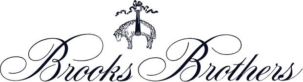
Emblem logos, with their rich tapestry of history and tradition, are visual storytellers that encapsulate brand names within intricately designed symbols or crests. Rooted in the age-old practice of heraldry, these logos have evolved from the banners and shields of knights and noble houses to become a staple in the identity of modern brands, educational institutions, and governmental agencies. The emblem logo's classic appeal lies in its ability to convey a sense of legacy, authority, and authenticity, making it particularly suited for brands that pride themselves on their heritage and craftsmanship.
Take, for example, the iconic emblem of Harley-Davidson, with its distinctive shield and bar design, or Starbucks’ mermaid crest. Both logos are instantly recognizable, embodying the brand’s ethos and heritage in a design that is both evocative and enduring. Such emblem logos are more than just marks; they are badges of honor that carry with them a narrative of tradition and quality.
Designing an emblem logo, however, requires a careful balance between complexity and clarity. The intricate details that lend these logos their character and depth must also be tempered with the need for simplicity to ensure scalability and readability across various applications. A well-designed emblem can transcend the confines of size and medium, maintaining its integrity whether it’s emblazoned on a storefront or displayed on the corner of a smartphone screen. This balance of detail and legibility is crucial, as it allows the emblem to serve as a versatile tool in the brand’s visual arsenal, adaptable yet always unmistakably connected to the brand’s core identity.
2. LogoType (Wordmarks):
Logotypes, or wordmarks, are a testament to the power of typography in branding. These logos are formed entirely from the company name, crafted with unique and often custom typography that captures the essence of the brand. The artistry in logotype design lies in selecting or creating a font that not only conveys the brand's personality but also ensures legibility and impact across various mediums. Two quintessential examples of effective logotypes are Google and Coca-Cola, each demonstrating how typography can be wielded to create an instantly recognizable global brand identity.
Google’s logotype is a masterclass in simplicity and color psychology, utilizing a sans-serif typeface that is approachable and easy to read, while the use of primary colors punctuated by a single secondary color speaks to its underlying values of innovation and reliability. Conversely, Coca-Cola's flowing, script font echoes themes of heritage, joy, and nostalgia, inviting emotional engagement from the viewer. Both brands highlight the versatility and expressive potential of logotypes, proving that a well-designed wordmark can embody a brand’s ethos without the need for additional graphic elements.
For new companies aiming to establish a foothold in the market, logotypes offer a strategic advantage in boosting name recognition. By focusing on the name itself, these businesses can direct their marketing efforts towards building a strong, memorable brand identity from the outset. However, the choice of font in a logotype cannot be overstated; it must resonate with the brand's personality, whether it's the professionalism of a serif font, the modernity of a sans-serif, or the uniqueness of a script. In essence, the logotype must serve as a mirror, reflecting the brand's core attributes and differentiating it in a crowded marketplace.
3. Pictorial Marks:
Pictorial marks, or logo symbols, are emblems characterized by their use of graphic images or icons that encapsulate a brand’s essence or values in a visually striking manner. Unlike abstract logos, which might play on conceptual or metaphorical imagery, pictorial marks often represent recognizable objects or entities. The simplicity of Apple’s apple or the immediacy of Twitter’s bird serves as powerful examples of how a well-crafted image can become an iconic representation of the brand itself.
The strength of a pictorial mark lies in its ability to communicate a brand’s identity through the universal language of imagery, transcending linguistic barriers and cultural differences. This universality makes pictorial marks particularly effective for global brands seeking widespread recognition. The choice of image in a pictorial mark is crucial, as it must not only align with the brand's values but also possess the potential to become synonymous with the brand over time. For instance, the bitten apple of Apple Inc. reflects themes of knowledge and innovation, while Twitter’s bird conveys the idea of communication and the spreading of ideas.
Crafting a pictorial mark that resonates with consumers requires a deep understanding of the brand’s core values and the message it wishes to convey. The chosen imagery should be distinct yet simple enough to ensure its effectiveness across various applications, from digital platforms to physical merchandise. Moreover, a successful pictorial mark can imbue a brand with a sense of personality and character, making it more relatable and memorable to its target audience. Over time, this imagery can foster a strong brand association, becoming ingrained in the public consciousness as a direct symbol of the brand itself, thus offering a powerful tool for long-term brand recognition and loyalty.
4. Abstract Logos:
Abstract logos stand out in the realm of branding for their use of geometric shapes and forms to encapsulate a business’s essence, opting for conceptual representation over recognizable imagery. Unlike pictorial marks, which anchor their identity in tangible images, abstract logos thrive on their ability to distill complex ideas into minimalist designs. Renowned examples include the dynamic stripes of Adidas, symbolizing mountain slopes and challenges to overcome, and the green and yellow sunflower of BP, representing energy in its various forms.
The power of an abstract logo lies in its versatility and the uniqueness of its symbolism. These logos can communicate a brand’s values or mission through design elements that are open to interpretation but crafted with intention. For instance, the abstract logo can convey a sense of innovation, dynamism, or sophistication, depending on its composition and color scheme. This flexibility makes abstract logos a popular choice across industries, particularly where businesses seek to differentiate themselves through a unique brand identity.
Moreover, abstract logos can encapsulate a brand's ethos without being tied to a specific image, allowing for broader application and adaptation over time. This characteristic is particularly beneficial for companies that may evolve their business focus or expand into new markets. Through simple yet potent designs, abstract logos invite the audience into a deeper engagement with the brand, encouraging interpretation and emotional connection, which can significantly enhance brand loyalty and recognition.
5. Lettermarks (Monograms):
Lettermarks, or monograms, distill a company’s branding to the essence of its initials, offering an elegant and streamlined approach to logo design. This type of logo is ideal for businesses with lengthy names, providing a concise yet impactful representation of the brand. Giants in their respective fields, IBM and HBO, utilize lettermarks to convey their legacy and authority through simple, bold typography that promises memorability and recognition.
The effectiveness of lettermarks lies in their simplicity and adaptability. By focusing on initials, these logos manage to maintain legibility and brand consistency across a wide range of mediums, from digital interfaces to physical merchandise. Moreover, the choice of typography in a lettermark is critical, as the font must encapsulate the brand's character while ensuring the logo's legibility and distinctiveness. Whether through elegant serifs that suggest tradition and sophistication or modern sans-serifs that convey a more contemporary and approachable feel, lettermarks can adapt to embody the brand’s ethos and appeal to its target audience.
6. Mascot Logos:
Mascot logos bring a brand's identity to life through illustrated characters that serve as the brand's ambassadors. These logos often feature colorful, cartoonish designs that can communicate the brand's story in a visually engaging and relatable way. Mascot logos, like KFC's Colonel Sanders and Kellogg's Tony the Tiger, not only enhance brand recognition but also forge a deeper emotional connection with the audience. They can personify the brand, imbuing it with personality and a sense of narrative that static logos cannot achieve.
Particularly effective in markets targeting families and children, mascot logos can create a friendly, approachable brand image that invites interaction and loyalty. The characters often become synonymous with the brand itself, participating in marketing campaigns, social media interactions, and even becoming cultural icons. The key to a successful mascot logo lies in its ability to convey the brand’s values and ethos through the character’s personality and story, making the brand more memorable and endearing to its audience.
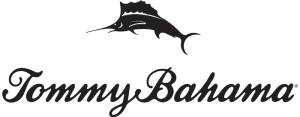
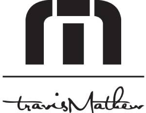
7. Combination Marks:
Combination marks are a versatile and dynamic type of logo that amalgamates various elements from the logo types discussed earlier, such as text and iconography. This approach allows for a high degree of customization and adaptability in branding, exemplified by brands like Doritos and Burger King. These logos offer the best of both worlds: the brand recognition that comes with a pictorial or abstract mark and the clarity and distinctiveness of a wordmark or lettermark.
The flexibility of combination marks is particularly advantageous for marketing and brand evolution. They can be deconstructed, with the iconographic and typographic elements used separately or together, allowing for versatile application across different mediums and contexts. This adaptability makes combination marks an excellent choice for brands looking to future-proof their identity, accommodating potential shifts in brand strategy or expansion into new markets without losing the core of their visual identity.
Conclusion:
The art of logo design is a crucial aspect of brand identity, offering a visual shorthand that communicates a company's ethos, values, and personality. From the tradition-infused emblem to the minimalist logotype, the narrative-rich mascot, and the versatile combination mark, each type of logo serves distinct strategic purposes in branding. Understanding these seven types of logos allows businesses to make informed decisions in crafting an identity that not only captures the essence of their brand but also resonates deeply with their target audience. Whether a startup seeking to carve out a niche or an established brand looking to refresh its image, the choice of logotype is a foundational step in the journey towards creating a memorable and impactful brand presence. In the dynamic landscape of brand communication, a well-designed logo stands as a beacon of identity, guiding the brand's narrative and fostering connections that transcend the visual, touching the very heart of its audience.
Categories
Recent Posts
- Where can I get Custom Polo T-Shirts in Bulk?
- The Best Custom Polos for Workwear and Events
- The Most Popular Custom Hats for Every Occasion
- Why Choose a Mesh Back Hat?
- The Perfect Pair: Branded Bills Hats for Embroidery
- Exploring Backstrap Options: The Benefits and Drawbacks of Popular Hat Closures
- Trendy Camo Hats for the Outdoors: Customize the Richardson 111P with LogoUp
- The Ultimate Guide to Customizing the Richardson 320 Washed Chino Hat with Embroidery
- Embroidery on the Otto Cap 39-165: High-Performance Customization for Every Occasion
- LogoUp Holiday Gifts: Embroidered and DTF-Decorated Richardson 112, 112PFP, and 112PM
Add Comment